[Design] - The Kitchen, second cut and walkabout in Godot
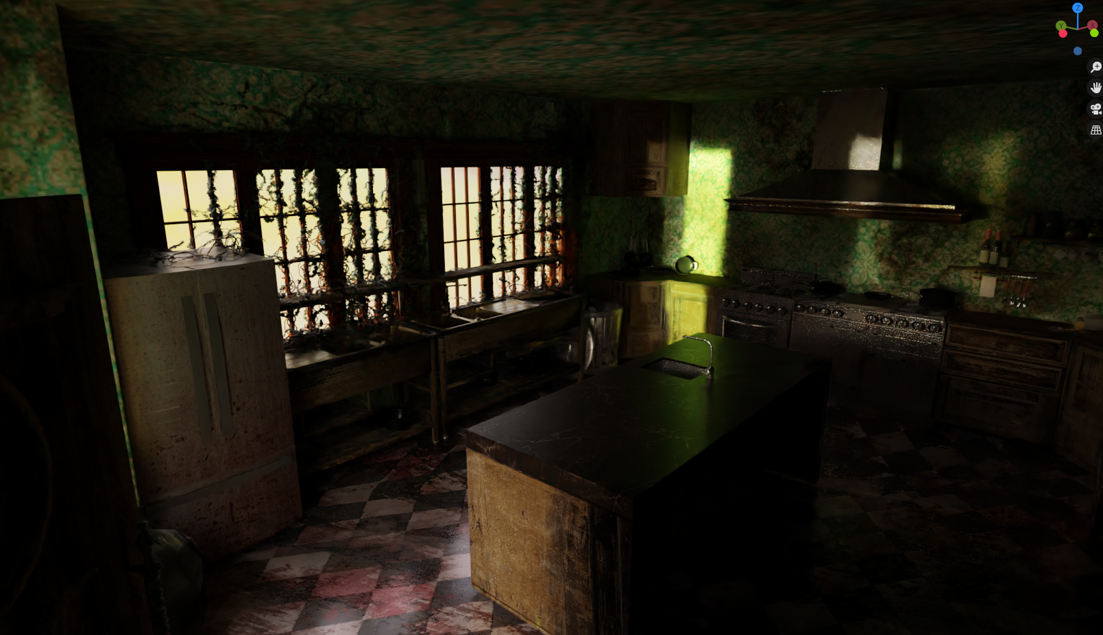
Strange day today, mostly spent tinkering in the kitchen unhappy with the results. But then the simple addition of Ivy to the window dramatically changed the nature of the scene and it all came together quite well:

The central table is still using a texture that is far too 'clean' for this room, the floor tiles and wallpaper have obvious repetition and the fridge is a bit too low poly, but all in all I'm enjoying how this room is coming together.
As I also still think the room is too small for the Loftly's, a walk in larder will be attached off to the side.
Anyway as the kitchen hit a 'that'l do for now" checkpoint, I decided it wouldn't hurt to re-import all the updated rooms back into Godot and have another play, though this time ditching the Silent Hill style controls and going first person with a torch (how cliche, but dayum if it doesn't work well):
The Lounge
Billiard Room to the Kitchen
There's a fair amount broken in the hallway, but more importantly there is an obscene frame rate drop near the Lounge that I have not figured out the cause of, hence the video is split in two.
Considering this is literally dumped into Godot and spent maybe two hours tweaking lighting and textures, I think it looks great! I'm happy with the progress and already having some ideas for some of the effects I want to try and recreate. The first person aesthetic does require I pay more attention to texturing/modelling everything correctly though, rather than fixed cameras giving me leeway to get lazy in corners, but that's ok.
Anywho, thanks
Bimbam.
Get Estate of the Damned
Estate of the Damned
Developing a Survival Horror in Godot. WIP.
| Status | In development |
| Author | Bimbam |
| Genre | Survival |
| Tags | Dark, Godot, Horror, Psychological Horror, Singleplayer, Survival Horror |
| Languages | English |
More posts
- [In Engine Clip] - Playing with lightJan 23, 2021
- [In Engine Clip] - Playing with fireJan 16, 2021
- [In Engine Clip] - Forest of fogDec 25, 2020
- [In Engine Clip] - Halloween UpdatesOct 31, 2020
- [In Engine Clip] - Doors and InteractionsOct 28, 2020
- [In Engine Clip] - Exploring new roomsOct 22, 2020
- [Design Update ] - Music RoomOct 18, 2020
- [Design Update ] - Hallway ArchesOct 01, 2020
- [Design] - Back to Blender, More Housework!Sep 30, 2020
- [Mechanics] - Sound, Performance, and deathSep 24, 2020

Leave a comment
Log in with itch.io to leave a comment.